- ×
CSS3 3D animation library
Filed under animationShow All#GFX
GFX is an 3D CSS3 animation library that extends jQuery with some useful functionality for programmatically creating CSS3 transitions. CSS3 transitions are superior to manual ones (using setTimeout) since they're hardware accelerated, something particularly noticeable on mobile devices.
GFX currently only supports WebKit browsers (Safari/Chrome). Firefox support is planned. For best results, use WebKit Nightly
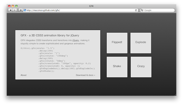
To see some demos, checkout GFX's site.
#Basic usage
Usage is very straightforward, simply include the
gfx.jsfile in the page, along with jQuery.<script src="site/jquery.js" type="text/javascript" charset="utf-8"></script> <script src="lib/gfx.js" type="text/javascript" charset="utf-8"></script>Then call,
$.fn.gfx(), passing in a set of properties and optional options.$("#element").gfx(properties, options)Properties can be any CSS styles that you want to transition, such as
color,backgroundorwidth. In addition, any properties that you'd normally use with-webkit-transform, can be used without thetransformprefix, such as withscaleandrotatein the example below.$(this).gfx({ scale: "1.5", rotate: "180deg" })Valid options for
gfx()are:duration- animation duration in millisecondseasing- animation flow control, eitherlinear,ease-in,ease-out,ease-in-out, or a custom cubic beziercomplete- a callback function executed after the animation has finishedqueue- specifies which animation queue to use, by defaultfx. Set to false to disable queuing
As with normal jQuery animations, GFX transitions can be chained so they run one after an other. Additionally, you can still use the
delay()function..gfx({ rotate: "0deg", translateX: "-100px" }).delay(100).gfx({ scale: "1" }).gfx({ rotate: "0deg", translateX: "-100px" })##In-built effects
GFX comes with several in built effects, but you can easily add your own. They do what they say on the tin. To seem them live checkout the GFX website.
$.fn.gfxExplodeOut()
$.fn.gfxExplodeIn()
$.fn.gfxBlip()
$.fn.gfxFadeIn()
$.fn.gfxFadeOut()
#Overlay
GFX comes with a overlay (lightbox) effect. First include the script
gfx.overlay.js(aftergfx.js).<script src="lib/gfx.overlay.js" type="text/javascript" charset="utf-8"></script>Then call
$.gfxOverlay(), passing in a element and optional settings. The element will be cloned and presented to the user above the overlay. If you specify a<script />element, then GFX will use the script's inner HTML. You should also specify a height and width for the dialog box.$(".about").click(function() { return $.gfxOverlay("#aboutText", {width: 300, height: 130}); });#Flip
The flip effect is for showing two elements that be can flipped between. To use it, first include the
gfx.flip.jsscript.<script src="lib/gfx.flip.js" type="text/javascript" charset="utf-8"></script>Then you need to create an element with the correct markup, including two children with
.frontand.backclasses. You may want to set the.backelement'sdisplaytononein your CSS file to avoid a flash before the JS kicks in.<div id="flip"> <div class="front">Front</div> <div class="back">Back</div> </div>Now call
$.fn.gfxFlip()to setup the flipping. To activate a flip, trigger theflipevent on the element.$("#flip").gfxFlip().click(function() { return $(this).trigger("flip"); });#Cube
The Cube is great for displaying multiple pieces of information, perhaps steps in a tutorial or setup procedure. As before, you first need to include the
gfx.cube.jsfile.<script src="lib/gfx.cube.js" type="text/javascript" charset="utf-8"></script>Then setup the correct element structure:
<div id="cube">
  <div class="front"></div>
  <div class="back"></div>
  <div class="left"></div>
  <div class="right"></div>
  <div class="top"></div>
  <div class="bottom"></div>
</div>
You don't have to include all the faces, just the
frontface is required. Now call$.fn.gfxCube(), passing in theheightandwidthof the cube.$("#cube").gfxCube({ width: 500, height: 290 });To change the face, just trigger the
cubeevent, passing in the face name as event data.$(".download").click(function() { return $("#cube").trigger("cube", "right"); }); $(".back").click(function() { return $("#cube").trigger("cube", "front"); });#Transforms
GFX supports the following CSS3 transforms:
- scale
- scaleX
- scaleY
- scale3d
- rotate
- rotateX
- rotateY
- rotateZ
- rotate3d
- translate
- translateX
- translateY
- translateZ
- translate3d
- skew
- skewX
- skewY
- matrix
- matrix3d
- perspective
CSS Transforms are a whole subject to themselves, and unfortunately there isn't space to elaborate on them here. Luckily David DeSandro has created a great set of tutorials, which you can find here.
Additionally the WebKit blog has a great article on transitions when they first introduced, and the Apple Developer center also provides good documentation.
#Demos
More demos are planned, but feel free to contribute ideas if you coming up with a cool idea. At the moment, I'm thinking of re-creating the interfaces from Time Machine and Windows 8.