- ×
Angular UI library to illustrate and validate a password's strength with material design - Angular V8 supported
Filed under application tools › frameworksShow All
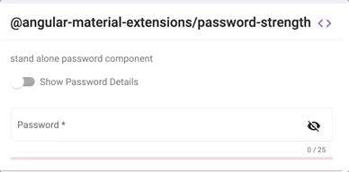
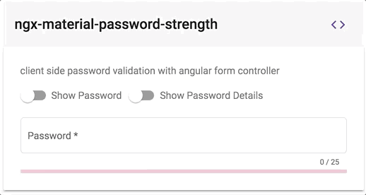
@angular-material-extensions/password-strength - Material password strength meter to indicate how secure is the provided password


Built by and for developers :heart:
Do you have any question or suggestion ? Please do not hesitate to contact us! Alternatively, provide a PR | open an appropriate issue here
If you like this project, support angular-material-extensions by starring :star: and sharing it :loudspeaker:
Table of Contents
- Demo
- Components
- Dependencies
- Installation
- API
- Usage
- Run Demo App Locally
- Development
- Other Angular Libraries
- Support
- License
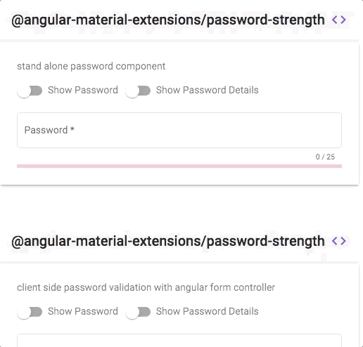
Demo
View all the directives and components in action at https://angular-material-extensions.github.io/password-strength
Library's components
<mat-password-strength>used to calculate and display the strength of a provided passwordstrength score <= 20%
- strength score <= 80%
- strength score > 80%
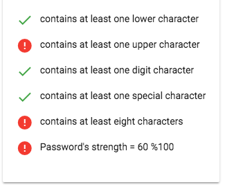
<mat-password-strength-info>used to display more information about the strength of a provided password
<mat-pass-toggle-visibility>used to show/hide the password provided in the input element
Dependencies
- Angular developed and tested with
15.x
Installation
1. Install via ng add. (Recommended)
If Angular Material Design is not setup, just run
ng add @angular/materiallearn moreNow add the library via the
angular schematicsng add @angular-material-extensions/password-strength2. Install via npm. (Alternative)
Now install
@angular-material-extensions/password-strengthvia:npm install --save @angular-material-extensions/password-strength
SystemJS
Note:If you are using
SystemJS, you should adjust your configuration to point to the UMD bundle. In your systemjs config file,mapneeds to tell the System loader where to look for@angular-material-extensions/password-strength:{ '@angular-material-extensions/password-strength';: 'node_modules/@angular-material-extensions/password-strength/bundles/password-strength.umd.js', }-> follow the instructionshere
Import the library
Once installed you need to import the main module:
import { MatPasswordStrengthModule } from "@angular-material-extensions/password-strength";The only remaining part is to list the imported module in your application module. The exact method will be slightly different for the root (top-level) module for which you should end up with the code similar to (notice
MatPasswordStrengthModule .forRoot()):import { MatPasswordStrengthModule } from '@angular-material-extensions/password-strength'; @NgModule({ declarations: [AppComponent, ...], imports: [MatPasswordStrengthModule.forRoot(), ...], bootstrap: [AppComponent] }) export class AppModule { }Other modules in your application can simply import
MatPasswordStrengthModule:import { MatPasswordStrengthModule } from '@angular-material-extensions/password-strength'; @NgModule({ declarations: [OtherComponent, ...], imports: [MatPasswordStrengthModule, ...], }) export class OtherModule { }API
<mat-password-strength>used to calculate and display the strength of a provided password - see the demo examplesoption bind type default description password Input()string - the password to calculate its strength customValidator Input()RegExp - custom regex validator externalError Input()booleanfalseused to change the color of the password to warn if an external error occurs enableLengthRule Input()booleantruewhether to validate the length of the password enableLowerCaseLetterRule Input()booleantruewhether a lowercase letter is optional enableUpperCaseLetterRule Input()booleantruewhether a uppercase letter is optional enableDigitRule Input()booleantruewhether a digit char is optional enableSpecialCharRule Input()booleantrue whether a special char is optional min Input()number8 the minimum length of the password max Input()number30 the maximum length of the password warnThreshold Input()number21 password strength less than this number shows the warn color accentThreshold Input()number81 password strength less than this number shows the accent color onStrengthChanged Output() number- emits the strength of the provided password in % e.g: 20%, 40%, 60%, 80% or 100% <mat-password-strength-info>used to display more information about the strength of a provided password - see the demo examplesoption bind type default description passwordComponent Input()PasswordStrengthComponent - the password component used in the template in order to display more info related to the provided password enableScoreInfo Input()booleanfalsewhether to show the password's score in % lowerCaseCriteriaMsg Input()stringcontains at least one lower character an appropriate msg for the lower case % upperCaseCriteriaMsg Input()stringcontains at least one upper character an appropriate msg for the upper case % digitsCriteriaMsg Input()stringcontains at least one digit character an appropriate msg for the digit case % specialCharsCriteriaMsg Input()stringcontains at least one special character an appropriate msg for the special case % customCharsCriteriaMsg Input()stringcontains at least one custom character an appropriate msg for the custom validator case % minCharsCriteriaMsg Input()stringcontains at least \${this.passwordComponent.min} characters an appropriate msg for the minimum numberof chars %<mat-pass-toggle-visibility>used to show/hide the password provided in the input elementoption bind type default description isVisible Input()booleanfalsewhether the password is visible or hidden tabindex Input()stringnullset the desired tabindex value of the toggle visibility button.
Usage
add the
@angular-material-extensions/password-strengthelement to your template:<mat-password-strength [password]="password.value"> </mat-password-strength>This will display only the material password strength meter in form of a progress without any input fields or similar.
In the following example, we integration a material input container with
@angular-material-extensions/password-strength's component.NOTE: In order to repaint the mat-form-field correctly after changing the value of the password's strength, please consider to change the detection strategy for the parent component -->
import {
  ChangeDetectionStrategy,
  Component,
  OnInit,
  ViewEncapsulation,
} from "@angular/core";
import { Title } from "@angular/platform-browser";
import { MatSlideToggleChange } from "@angular/material";
import { MatPasswordStrengthComponent } from "@angular-material-extensions/password-strength";

@Component({
  selector: "app-home",
  templateUrl: "./home.component.html",
  styleUrls: ["./home.component.scss"],
  encapsulation: ViewEncapsulation.None,
  changeDetection: ChangeDetectionStrategy.OnPush,
})
export class HomeComponent implements OnInit {}
<div> <mat-form-field appearance="outline" style="width: 100%" [color]="passwordComponent.color" > <mat-label>Password</mat-label> <input matInput #password [type]="inputType" required placeholder="Password" /> <mat-hint align="end" aria-live="polite"> {{password.value.length}} / 25 </mat-hint> </mat-form-field> <mat-password-strength #passwordComponent (onStrengthChanged)="onStrengthChanged($event)" [password]="password.value" > </mat-password-strength> </div>learn more about mat-form-field
Example of how to use the emitted strength of the password in your template
<div fxLayout="row" fxLayoutGap="10px">
  <div *ngIf="passwordComponent.strength === 100; then done else error"></div>
  <ng-template #done>
    <mat-icon color="primary">done</mat-icon>
  </ng-template>
  <ng-template #error>
    <mat-icon color="warn">error</mat-icon>
  </ng-template>
  <div>
    <p>Password's strength = {{passwordComponent.strength}} %100</p>
  </div>
</div>
Use the toggle visibility component
- add the
mat-pass-toggle-visibilityto yourmat-form-field - give it a name to use it in the html file like
toggle - set the type of the input to that value emitted from the
mat-pass-toggle-visibilitycomponent<input matInput [type]="toggle.type"/>
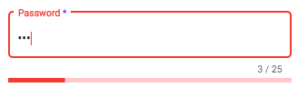
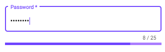
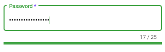
<mat-form-field
  appearance="outline"
  style="width: 100%"
  [color]="passwordComponent.color"
>
  <mat-label>Password</mat-label>
  <!-- HERE DOWN :D-->
  <mat-pass-toggle-visibility #toggle matSuffix></mat-pass-toggle-visibility>
  <!-- THERE ABOVE ;)-->
  <input
    matInput
    #password
    [type]="toggle.type"
    required
    placeholder="Password"
  />
  <mat-hint align="end" aria-live="polite">
    {{password.value.length}} / 25
  </mat-hint>
</mat-form-field>
Client Side password's validation using a built in angular formController
- add an input element to your template with an appropriate @angular-material-extensions/password-strength's component
- hold a reference of the @angular-material-extensions/password-strength's component by adding
passwordComponentWithValidation(or whatever you want) inside the element
e.g:
<mat-password-strength
  #passwordComponentWithValidation
  [password]="passwordWithValidation.value"
>
</mat-password-strength>
bind the form controller of the mat-password-strength to the input element
you can access the form controller of @angular-material-extensions/password-strength using the chile view -->
passwordComponentWithValidation.passwordFormControlbind the form controller to an input element -->
[formControl]="passwordComponentWithValidation.passwordFormControl"Full example - see below
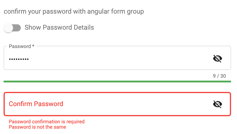
<div>
  <mat-form-field appearance="outline" style="width: 100%">
    <mat-label>Password</mat-label>
    <input
      matInput
      #passwordWithValidation
      [type]="inputType"
      required
      [formControl]="passwordComponentWithValidation.passwordFormControl"
      placeholder="Password"
    />
    <mat-hint align="end" aria-live="polite">
      {{passwordWithValidation.value.length}} / 25
    </mat-hint>
    <mat-error
      *ngIf="passwordComponentWithValidation.passwordFormControl.hasError('required')"
    >
      Password is required
    </mat-error>
    <mat-error
      *ngIf="passwordComponentWithValidation.passwordFormControl.hasError('pattern')"
    >
      Password is not valid
    </mat-error>
  </mat-form-field>
  <mat-password-strength
    #passwordComponentWithValidation
    (onStrengthChanged)="onStrengthChanged($event)"
    [password]="passwordWithValidation.value"
  >
  </mat-password-strength>
  <!--Password's strength info-->
  <mat-password-strength-info
    [passwordComponent]="passwordComponentWithValidation"
  >
  </mat-password-strength-info>
</div>
this will looks like -->
custom regex validation
please consider to use the
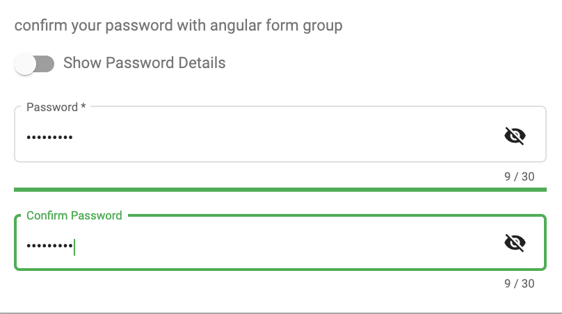
customValidatorinput (see below)<mat-slide-toggle #toggle>Show Password Details</mat-slide-toggle> <mat-form-field appearance="outline" style="width: 100%" [color]="passwordComponent.color" > <mat-label>Password</mat-label> <mat-pass-toggle-visibility #toggleVisbility matSuffix ></mat-pass-toggle-visibility> <input matInput #password [type]="toggleVisbility.type" placeholder="Password" /> <mat-hint align="end" aria-live="polite"> {{password.value.length}} / {{passwordComponent.max}} </mat-hint> </mat-form-field> <mat-password-strength #passwordComponent (onStrengthChanged)="onStrengthChanged($event)" [password]="password.value" [customValidator]="pattern" > </mat-password-strength> <mat-password-strength-info *ngIf="toggle.checked" [passwordComponent]="passwordComponent6" customCharsCriteriaMsg="1 german special chars is required" [enableScoreInfo]="true" > </mat-password-strength-info>pattern = new RegExp(/^(?=.*?[äöüÄÖÜß])/);Confirm the password with built in angular form controllers - see the live example
Use always the green color for a strong password just by adding the
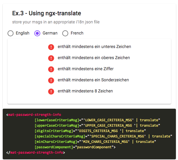
greencss class to themat-password-strength<mat-password-strength #passwordComponent class="green" [password]="password.value" > </mat-password-strength>Supporting custom messages and ngx-translate for the info component please check the example demo here
for more examples please visit this URL : (https://angular-material-extensions.github.io/password-strength/examples
Please checkout the full documentation here or follow the official tutorial
Run Demo App Locally
Development
Other Angular Libraries
- ngx-auth-firebaseui
- ngx-mailto
- ngx-linkifyjs
- @angular-material-extensions/google-maps-autocomplete
- @angular-material-extensions/select-country
- @angular-material-extensions/select-icon
- @angular-material-extensions/fab-menu
- @angular-material-extensions/link-preview
- @angular-material-extensions/pages
- @angular-material-extensions/contacts
- @angular-material-extensions/faq
- @angular-material-extensions/combination-generator
Support
- Drop an email to: Anthony Nahas
- or open an appropriate issue
- let us chat on Gitter
Built by and for developers :heart: we will help you :punch:
Who is using this library? Awesome apps?
Are you missing your project or you app? PR me to publish it on the README

This project is supported by jetbrains with 1 ALL PRODUCTS PACK OS LICENSE incl. webstorm
License
Copyright (c) 2019-2023 Anthony Nahas. Licensed under the MIT License (MIT)