- ×
A super-lightweight, highly configurable, cross-browser date picker jQuery plugin.
Filed under user interfaceShow All
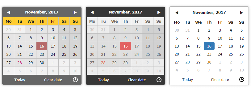
Zebra Datepicker

A super-lightweight, highly configurable, cross-browser date time picker jQuery plugin


Enhance your forms with the powerful and highly-configurable Zebra Datepicker date time picker jQuery plugin. This date time picker adds an intuitive calendar interface for selecting dates and times, complete with a convenient month and year jump feature. The selected date will be formatted and entered into the input field according to your specified options. Simply attach the plugin to your input fields and let the calendar icon do the rest.
Features
- it is small – it weighs around 30KB minified (9.1KB gzipped) offering the best ratio of features per used bytes
- it is both a date picker as well as a time picker
- it's cross-browser – works in every major browser; works also in Internet Explorer 6 (as long as you are using a version of the date picker that is less than 2.0.0)!
- has a default color scheme that blends-in well with almost any design, and it's easily customizable through the well-organized CSS file; two additional themes are included, one of them being for use with Twitter Bootstrap
- offers an intuitive interface allowing for easy navigation through months and years
- offers an intuitive mechanism for disabling dates and date ranges using a syntax similar to cron's syntax
- supports defining of custom weekend days for countries that don't have the weekend on Saturday and Sunday
- supports most of date formats you can think of, borrowing the syntax of PHP's date function
- supports all sorts of combinations for starting and ending dates
- date pickers can be "paired" – where one or more date pickers will use the value of another date picker as starting date
- supports internationalization
- supports RTL languages
- works by automatically attaching a small calendar icon to the indicated input fields which displays the attached date picker when clicked.
- it's compatible with AMD and CommonJS
🎂 Support the development of this project
Your support is greatly appreciated and it keeps me motivated continue working on open source projects. If you enjoy this project please star it by clicking on the star button at the top of the page. If you're feeling generous, you can also buy me a coffee through PayPal or become a sponsor. Thank you for your support! 🎉

Demo
See the demos
Requirements
Zebra Datepicker has no dependencies other than jQuery 1.7.0+ and requires that the page you are using the plugin on to have a strict doctype like:
<!doctype html>Installation
Zebra Datepicker is available as a npm package. To install it use:
# the "--save" argument adds the plugin as a dependency in packages.json
npm install zebra_datepicker --save
How to use
First, load jQuery from a CDN and provide a fallback to a local source like:
<script src="https://code.jquery.com/jquery-3.5.0.min.js"></script>
<script>window.jQuery || document.write('<script src="path/to/jquery-3.5.0.js"><\/script>')</script>
Load the Zebra Datepicker jQuery plugin:
<script src="path/to/zebra_datepicker.min.js"></script>Alternatively, you can load Zebra Datepicker from JSDelivr CDN like this:
<!-- for the most recent version, not recommended in production -->
<script
  src="https://cdn.jsdelivr.net/npm/zebra_datepicker@latest/dist/zebra_datepicker.min.js"></script>

<!-- for a specific version -->
<script
  src="https://cdn.jsdelivr.net/npm/zebra_datepicker@1.9.13/dist/zebra_datepicker.min.js"></script>

<!-- replacing "min" with "src" will serve you the non-compressed version -->
Load the style sheet file from a local source
<link rel="stylesheet" href="path/to/theme/zebra_datepicker.min.css">...or from JSDelivr CDN
<!-- for the most recent version of the "default" theme -->
<link
  rel="stylesheet"
  href="https://cdn.jsdelivr.net/npm/zebra_datepicker@latest/dist/css/default/zebra_datepicker.min.css">

<!-- for the most recent version of the "bootstrap" theme -->
<link
  rel="stylesheet"
  href="https://cdn.jsdelivr.net/npm/zebra_datepicker@latest/dist/css/bootstrap/zebra_datepicker.min.css">

<!-- replacing "min" with "src" will serve you the non-compressed version -->
Zebra Datepicker is also available on cdnjs, one of the most famous free and public web front-end CDN services
Now, within the DOM-ready event, attach the Zebra Datepicker plugin to a
<input type="text">control.$(document).ready(function() { // assuming the controls you want to attach the plugin to // have the "datepicker" class set $('input.datepicker').Zebra_DatePicker(); });This will attach a calendar and to the specified element(s). Clicking the icon, will make the date picker visible.
To get a reference to the instance of Zebra DatePicker attached to an element do:
var datepicker = $('selector').data('Zebra_DatePicker');Configuration options
Properties
All parameters are optional.
Note that any of the properties below may also be set via data attributes. To do this you have prefix the name of the property you want to set with
data-zdp_. One important thing to remember is that if the value of the property is an array you’ll have to use double quotes inside the square brackets and therefore single quotes around the attribute. See example.Property Type Default Description always_visible mixed falseShould the date picker be always visible?
Setting this property to a jQuery element will result in the date picker being always visible, the indicated element acting as the date picker's container;
Setting this property to booleantruewill result in the date picker not closing when selecting a date but only when the user clicks outside the date picker.container jQuery $('body')By default, the date picker is injected into the document's <body>element; use this property to tell the library to inject the date picker into a custom element - useful when you want the date picker to open at a specific position.current_date mixed falseBy default, the current date (the value of Today) is taken from the system where the date picker is run on.
Set this to a date in the format ofYYYY-MM-DDto use a different date.custom_classes Array falseDates that should have custom classes applied to them.
An object in the form of
{
'myclass1': [dates_to_apply_the_custom_class_to],
'myclass2': [dates_to_apply_the_custom_class_to]
}
...where dates_to_apply_the_custom_class_to is an array of dates in the same format as required for thedisabled_datesproperty.
Custom classes will be applied only in the day picker view and not on month/year views! Also note that the class name will have the "_disabled" suffix added if the day the class is applied to is disabled.
In order for the styles in your custom classes to be applied, make sure you are using the following syntax:
.Zebra_DatePicker .dp_daypicker td.myclass1 { .. }
.Zebra_DatePicker .dp_daypicker td.myclass1_disabled { .. }days Array ['Sunday', 'Monday', 'Tuesday', 'Wednesday', 'Thursday', 'Friday', 'Saturday']Days of the week, Sunday to Saturday. days_abbr mixed falseAbbreviated names of days.
By default, the abbreviated name of a day consists of the first 2 letters from the day's full name. While this is common for most languages, there are also exceptions for languages like Thai, Loa, Myanmar, etc. where this is not correct. For these cases, specify an array with the abbreviations to be used for the 7 days of the week; leave itfalseto use the first 2 letters of a day's name as the abbreviation.default_position string 'icon_top_right'The position of the date picker relative to the element it is attached to, or relative to the date picker icon.
Possible values are
- element_top_right
- element_bottom_right
- element_top_left
- element_bottom_left
- icon_top_right
- icon_bottom_right
- icon_top_left
- icon_bottom_left
Also note that, regardless of this setting, the date picker's position will be automatically adjusted to always fit in the viewport, if needed.
See also theoffsetproperty which also has an effect on the date picker's position.
Default isicon_top_rightmeaning that the date picker will be positioned at the top right of the icon.
Prior to version 2.0.1 the possible values were "above" and "below". For backward compatiblity these values are still valid and translate to "icon_top_right" and "icon_bottom_right" respectively.
This property will be ignored if
always_visibleorcontainerproperties are set!direction mixed 0Direction of the calendar
n(a positive integer) creates a future-only calendar beginning at n days after the reference date1-n(a negative integer) creates a past-only calendar ending n days before the reference date0creates a calendar with no restrictions- boolean
truecreates a future-only calendar starting with the reference date - boolean
falsefor a past-only calendar ending on the reference date
- first item is boolean
true(calendar starts on the reference date), apositive integer(calendar starts n days after the reference date), or avalid dategiven in the format defined by theformatattribute (calendar starts at the specified date), and the second item is booleanfalse(the calendar has no ending date), apositive integer(calendar ends n days after the starting date), or avalid dategiven in the format defined by theformatattribute and which occurs after the starting date (calendar ends at the specified date) - first item is boolean
false(calendar ends on the reference date), anegative integer(calendar ends n days before the reference date), or avalid dategiven in the format defined by theformatattribute (calendar ends at the specified date), and the second item is apositive integer(calendar ends n days before the ending date), or avalid dategiven in the format defined by theformatattribute and which occurs before the starting date (calendar starts at the specified date)
[1, 7]calendar starts tomorrow and ends seven days after that
[true, 7]calendar starts on the reference date and ends seven days after that
['2013-01-01', false]calendar starts on January 1st 2013 and has no ending date ("format" is YYYY-MM-DD)
[false, '2012-01-01']calendar ends on the reference date and starts on January 1st 2012 ("format" is YYYY-MM-DD)
Note that
disabled_datesproperty will still apply!
The
reference dateis the current date unless the date picker is thepairof another date picker, case in which the reference date is the date selected in that date picker.disable_time_picker boolean falseBy default, setting a format that also involves time ( h,H,g,G,i,s,a,A) will automatically enable the time picker. If you want to use a format that involves time but you don't want the time picker, set this property totrue.disabled_dates mixed false
no disabled datesAn array of disabled dates in the following format: 'day month year weekday'where weekday is optional and can be0-6(Saturday to Sunday).
The syntax is similar to cron's syntax: the values are separated by spaces and may contain(asterisk)-(dash) and,(comma) delimiters.
Examples:
['1 1 2012']would disable January 1, 2012
[' 1 2012']would disable all days in January 2012
['1-10 1 2012']would disable January 1 through 10 in 2012
['1,10 1 2012']would disable January 1 and 10 in 2012
['1-10,20,22,24 1-3 ']would disable 1 through 10, plus the 22nd and 24th of January through March for every year
[' 0,6']would disable all Saturdays and Sundays
['01 07 2012', '02 07 2012', ' 08 2012']would disable 1st and 2nd of July 2012, and all of August of 2012
DISABLING ALL DATES AND NOT SPECIFYING AT LEAST ONE ENABLED DATE WILL SEND THE SCRIPT INTO AN INFINITE LOOP SEARCHING FOR AN ENABLED DATE TO DISPLAY!
enabled_ampm mixed false
both am/pm are selectableAn array of selectable am/pm.
Allowed values are['am'],['pm'], or['am', 'pm'].
Applies only whenformatcontainsAora. Note that even when only one is enabled,onChange()will still be triggered when clicking the up/down buttons next to AM/PM on the timepicker.enabled_dates mixed false
all dates enabledAn array of enabled dates in the same format as required for disabled_datesproperty. To be used together with thedisabled_datesproperty by first setting thedisabled_datesproperty to something like[ ](which will disable everything) and the setting theenabled_datesproperty to, say,[ 0,6]to enable just weekends.enabled_hours mixed false
all hours are selectableAn array of selectable hours.
Applies only whenformatcontains one of the following characters:H,G,h,g. Valid values are between0-24(not padded with0!) whenformatcontainsHorGcharacters, and between1-12(not padded with0!) whenformatcontainshorgcharacters.enabled_minutes mixed false
all minutes are selectableAn array of selectable minutes.
Applies only whenformatcontains theicharacter. Valid values are between0-59(not padded with0!)enabled_seconds mixed false
all seconds are selectableAn array of selectable seconds.
Applies only whenformatcontains thescharacter. Valid values are between0-59(not padded with0!)fast_navigation boolean trueAllows users to quickly navigate through months and years by clicking on the date picker's top label. first_day_of_week integer 1
MondayWeek's starting day.
Valid values are0to6, Sunday to Saturday.format string 'Y-m-d'Format of the returned date.
Accepts the following characters for date formatting:d,D,j,l,N,w,S,F,m,M,n,Y,y,h,H,g,G,i,s,a,A, borrowing the syntax from PHP's date function.
Ifformatproperty contains time-related characters (g,G,h,H,i,s,a,A), the time picker will be automatically enabled.If you want to use a format that involves time but you don't want the time picker, set the
Note that when setting a date format without days (disable_time_pickerproperty to true.d,j), the users will be able to select only years and months, and when setting a format without months and days (F,m,M,n,t,d,j), the users will be able to select only years. Similarly, setting a format that contains only time-related characters, will result in users being able to only select time.Setting a time format containing
Also note that the value of theaorA(12-hour format) but usingHorGas the hour's format will result in the hour's format being automatically changed tohorg, respectively.viewproperty may be overridden if it is the case (i.e. a value ofdaysfor theviewproperty makes no sense if the date format doesn't allow the selection of days).header_captions object header_captions: {
days: 'F, Y',
months: 'Y',
years: 'Y1 - Y2'
}Captions in the date picker's header, for the 3 applicable views: days,months,years
For each of the 3 views the following special characters may be used borrowing from PHP's date function's syntax:m,n,F,M,yandY; any of these will be replaced at runtime with the appropriate date fragment, depending on the currently viewed date.
Two more special characters are also availableY1andY2(upper case representing years with 4 digits, lowercase representing years with 2 digits) which representcurrently selected year - 7andcurrently selected year + 4and which are used only in theyearsview.
Even though any of these special characters may be used in any of the 3 views, you should usem,n,F,Mfor thedaysview andy,Y,Y1,Y2,y1,y2for themonthsandyearsview or you may get unexpected results!
Text and HTML can also be used, and will be rendered as it is, as in the example below (the library is smart enough to not replace special characters when used in words or HTML tags):
header_captions: {
days: 'Departure:<br>F, Y',
months: 'Departure:<br>Y',
years: 'Departure:<br>Y1 - Y2'
}
icon_margin mixed falseThe left and right white-space around the icon
If theinsideproperty is set totruethen the target element's padding will be altered so that the element's left or right padding (depending on the value oficon_position) will be2 x icon_marginplus the icon's width.
If theinsideproperty is set tofalse, then this will be the distance between the element and the icon.
Leave it tofalseto use the element's existing paddingicon_position string 'right'Icon's position.
Accepted values areleftandrightinside boolean trueShould the icon for opening the date picker be inside the element?
If set tofalse, the icon will be placed to the right of the parent element, while if set totrueit will be placed to the right of the parent element, but inside the element itselflang_clear_date string 'Clear'the caption for the Clear button. months array ['January', 'February', 'March', 'April', 'May', 'June', 'July', 'August', 'September', 'October', 'November', 'December'],Month names months_abbr mixed falseAbbreviated names of months.
By default, the abbreviated name of a month consists of the first 3 letters from the month's full name. While this is common for most languages, there are also exceptions for languages like Thai, Loa, Myanmar, etc. where this is not correct. For these cases, specify an array with the abbreviations to be used for the months of the year; leave itfalseto use the first 3 letters of a month's name as the abbreviation.navigation Array navigation: ['◀', '▶', '▲', '▼']HTML to be used for the previous/next and up/down buttons, in that order. offset array [5, -5]The offset, in pixels (x, y), to shift the date picker's position after it was positioned according to the value of the default_positionproperty.
For optimal results, ifdefault_positionproperty contains the word "above", the value ofyshould negative, and positive otherwise.
Also, ifdefault_positionproperty contains the word "right", the value ofxshould be positive, and negative otherwise.open_icon_only boolean falseWhen set to true, the date picker will show only when users click on the associated icon, and not also when clicking the associated element.open_on_focus boolean falseSet this property to trueif you want the date picker to be shown when the parent element (ifopen_icon_onlyis not set tofalse) or the associated calendar icon (ifshow_iconis not set tofalse) receive focus.pair object false
not paired with another date pickerIf set as one or more jQuery elements with Zebra Datepicker attached, those particular date pickers will use the current date picker's value as starting date
Note that the rules set in thedirectionproperty will still apply but the reference date will not be the current system date but the value selected in the current date picker.
Use this property only on the date picker containing the "starting date" and not also on the one with the "ending date", or the
directionproperty of the second date picker will not work as expected!readonly_element boolean trueShould the element the calendar is attached to, be read-only?
If set totrue, a date can be set only through the date picker and cannot be entered manually.rtl boolean falseWhether text should be drawn from right to left. select_other_months boolean falseShould days from previous and/or next month be selectable when visible?
Note that if the value of this property is set totrue, the value ofshow_other_monthswill be consideredtrueregardless of the actual value!show_clear_date mixed 0Should the Clear date button be visible?
Accepted values are:
0- the button for clearing a previously selected date is shown only if a previously selected date already exists; this means that if there's no date selected, this button will not be visible; once the user picked a date and opens the date picker again, this time the button will be visible.truewill make the button visible all the timefalsewill disable the button
show_icon mixed Pick a dateShould a calendar icon be added to the elements the plugin is attached to?
Set this property's value to booleanfalseif you don't want the calendar icon.
Note that the text is not visible by default sincetext-indentationis set to a big negative value in the CSS, so you might want to change that in case you want to make the text visible.
When not set to booleanfalsethe plugin will attach a calendar icon to the elements the plugin is attached to.show_other_months boolean trueShould days from previous and/or next month be visible? show_select_today mixed 'Today'Should the Today button be visible?
Setting this property to anything but a booleanfalsewill enable the button and will use the property's value as caption for the button. Setting it tofalsewill disable the button.show_week_number mixed falseShould the ISO 8601 week number be displayed?
Anything other thanfalsewill enable this feature, and use the given value as column title. For example,show_week_number: 'Wk'would enable this feature and have Wk as the column's title.start_date mixed falseA default date to start the date picker with
Must be specified in the format defined by theformatproperty, or as a JavaScript Date object
If you have a date format that contains time and you need to set a default time but the date should be the current date, here's one way of doing it:
Prior to version1.9.11:
var date = new Date(); // have this somewhere
// set the start_date property like
start_date: date.getFullYear() + '-' +
(date.getMonth() + 1 < 10 ? '0' : '') +
(date.getMonth() + 1) + '-' +
(date.getDate() < 10 ? '0' : date.getDate()) +
' 12:00'
Starting with version1.9.11:
start_date: new Date()
Note that this value is used only if there is no value in the field the date picker is attached to!
The property's value can be a JavaScript Date object since version 1.9.11
strict boolean falseShould default values, in the input field the date picker is attached to, be deleted if they are not valid according to directionand/ordisabled_dates?view string 'days'How should the date picker start:
Valid values aredays,months,yearsandtime.
Note that the date picker is always cyclingdays -> months -> yearswhen clicking in the date picker's header, andyears -> months -> dayswhen selecting dates (skipping the views that are missing because of the date's format)
The value of theviewproperty may be overridden if the date's format requires so! (i.e.daysfor theviewproperty makes no sense if the date format doesn't allow the selection of days)weekend_days Array [0, 6]
Saturday and SundayDays of the week that are considered weekend days
Valid values are0to6, Sunday to Saturday.zero_pad boolean falseShould day numbers < 10 be padded with zero?
When set totrue, day numbers < 10 will be prefixed with0.Events
onChangeCallback to be executed whenever the user changes the view (days/months/years/time), as well as when the user navigates by clicking on the
next/previousicons in any of the views;The callback function receives 2 arguments
- the current view (
days,months,yearsortime) - an array containing the active elements (not disabled) from the view, as jQuery elements, allowing for easy customization and interaction with particular cells in the date picker's view
The
thiskeyword inside the callback function refers to the element the date picker is attached to, as a jQuery object.
To get the plugin's properties doproperties = this.data('Zebra_DatePicker').For simplifying searching for particular dates, each element gets a
datedata attribute whose format depends on the value of theviewargument as follows:YYYY-MM-DDfor elements in thedaysviewYYYY-MMfor elements in themonthsviewYYYYfor elements in theyearsview
Note that this data attribute is not also set for elements in the
timeview.Here's how we could highlight the 24th day of each month of each year:
$('selector').Zebra_DatePicker({ // execute a function whenever the user changes the view // (days/months/years), as well as when the user // navigates by clicking on the "next"/"previous" icons // in any of the views onChange: function(view, elements) { // on the "days" view... if (view === 'days') { // iterate through the active elements in the view elements.each(function() { // to simplify searching for particular dates, // each element gets a "date" data attribute which // is the form of: // - YYYY-MM-DD for elements in the "days" view // - YYYY-MM for elements in the "months" view // - YYYY for elements in the "years" view // so, because we're on a "days" view, // let's find the 24th day using a regular // expression (notice that this will apply to // every 24th day of every month of every year) if ($(this).data('date').match(/\-24$/)) // and highlight it! $(this).css({ backgroundColor: '#C40000', color: '#FFF' }); }); } } });onClearCallback function to be executed when the user clicks the Clear button.
The callback function takes no arguments. The
thiskeyword inside the callback function refers to the element the date picker is attached to, as a jQuery object.
To get the plugin's properties doproperties = this.data('Zebra_DatePicker').onCloseCallback function to be executed when the date picker is closed.
The callback function takes no arguments. The
thiskeyword inside the callback function refers to the element the date picker is attached to, as a jQuery object.
To get the plugin's properties doproperties = this.data('Zebra_DatePicker').onOpenCallback function to be executed when the date picker is shown.
The callback function takes no arguments. The
thiskeyword inside the callback function refers to the element the date picker is attached to, as a jQuery object.
To get the plugin's properties doproperties = this.data('Zebra_DatePicker').onSelectCallback function to be executed when a date is selected.
The callback function takes 3 arguments:
- the date in the format specified by the
formatattribute - the date in
YYYY-MM-DDformat and additionally hours, minutes and seconds if time picker is enabled - the date as a JavaScript Date object
thisinside the callback function refers to the element the date picker is attached to, as a jQuery object.
To get the plugin's properties doproperties = this.data('Zebra_DatePicker').Methods
First, get a reference to the plugin like
var datepicker = $('selector').data('Zebra_DatePicker');Then call a method like
datepicker.update();clear_date()Clears the selected date (if any)
destroy()Removes the plugin from an element
set_date(date)Sets the value of the element the date picker is attached to, to the specified date;
The date must be in the format defined by the
formatproperty or a JavaScriptDateobject.The date will not be set if it is disabled (either because of
disabled_datesor because ofdirectionproperties)The method's argument can be a JavaScript
Dateobject since version1.9.11show()Shows the date picker (unless the
always_visibleproperty is set totrue)hide()Hides the date picker (unless the
always_visibleproperty is set totrue)update([options])Updates configuration options at run-time, and recalculates date picker's icon position relative to the parent element. You should call this method whenever you show/hide/reposition the parent element, or alter the parent element's dimensions.
The method accepts an optional argument - an object with configuration options to update:
var datepicker = $('selector').data('Zebra_DatePicker');
datepicker.update({
    direction: 1
});
If you just want to update the icon's position, simply call the method without any arguments:
var datepicker = $('selector').data('Zebra_DatePicker');
datepicker.update();
Global options
If you have multiple date pickers that share common options you can set these options like this:
// this needs to be called only once and does
// not have to be called from within a "ready" block!
$.fn.Zebra_DatePicker.defaults = {
    // any valid options
}
Any options set like this will be applied to all the newly created date picker. Obviously, options set at the creation of any new date picker would overwrite the respective defaults.
Sponsors
Cross browser/device testing is done with
